Thursday, 8 December 2016

My own magazine - finished product


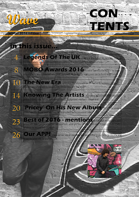
This is the final product of my magazine task, I have completed the front cover, Contents and double page spread in a way which I believe is suitable for publication, below I will be mentioning any final touches made to each segment of the magazine.

 Front cover:

  • Changed the name from 'double move' to 'second-self' I think that second self is a more suitable name for cover artists who are twins, it's also vague and easy to the ear.
  • Added a bit more to the 'behind the success of...' cover line, this is because mentioning the fact that there are more artists make it more likely for a target audience to purchase the magazine.
  • Added more depth to the masthead, before it looked plain and thin, by adding another layer it carries meaning and becomes aesthetically pleasing. 

Contents page:

  • removed the picture from the dps and added another one of the location photography images as a replacement 

Double page spread:

  • removed the 'PRICEY' header and changed it into a different version of the masthead (matched to the colour scheme of the page)
  • minor changes to the interview content, last question relates to the page background so that the audience will know why it is there
  • Added page numbers at the bottom
  • Moved the 'PRICEY header so it is at the end of the article, I also moved the image of the artist so that it could give enough space for one more question and answer so that the page looks like it has more content overall

My own magazine #5


At this point, my magazine it pretty much complete, I have the overall layout set and the only differences I need to make now would be very minimal, for example:
  • Changing the image on the contents page so that it is not the same as the one on the double page spread
  • Changes to the interview content, i'll redesign the last question so that it is not as short and boring
  • Changes to the images if possible, specifically making the edges look curved, straight edges make it look obvious that the picture was just placed and resized (DPS and Contents)
  • Probably change the name of the cover artists to something more suited towards the magazine.
  • Adding another layer to the masthead on the front cover so that it looks more 'full' and visible, similar to the contents page.

Friday, 2 December 2016

My own magazine #4 double page spread focus

This lesson I mainly focused on the double page spread, this is because it was the section of the magazine that required the most attention.
changes made during this session:
  • background changed into large image
  • lettering - white for answers and blue for questions/title. 
  • grey background added into textbox so that text becomes more visible
  • social media links added
  • picture of main star added on the bottom right
future changes to be made:
  • reposition of main stars image, possibly try to make the corners less 'obvious'
  • may add a masthead to the double page
  • page numbers need to be added
  • any other changes to magazine will be mentioned

Thursday, 1 December 2016

my own magazine #3


This lesson I was able to make improvements and changes to my magazine. The things I changed from each of the three parts were:

front cover:

  • new colour scheme, changed from black/white/gold to black/grey/red.
  • complete renovation of the masthead, no longer gold, font changed from forte to agency FB
  • moved masthead behind the model

contents:

  • removed masthead and added new design
  • added grey shadow  to give depth to the masthead and contents banner
  • added more images to the page and removed lines around each section. makes it look more professional.

Double page spread:

I just started the double page spread and these are the segments I must add for it to be complete:
  • Background image 
  • Any colour issues made by the background will be addressed


Monday, 28 November 2016

my own magazine


I have just started my contents page for my real magazine, I have quickly added the masthead and 'CONTENTS' heading and will be working on this using the flat plan I created earlier, this lesson I focused on the actual layout of the contents page. I successfully added the content from my mock up and was also able to add an image with the time that I had.

I have also designed a question and answer question with somebody who would be likely to answer like a typical artist would, I will include this in my double page spread, it will make it look 'full' and will also have interesting exclusive content for the reader.

 When did you realise music was your ‘thing’, your passion?

(laugh) This is a funny story, when I was really young, around 7 or 8, I was singing in shower. My mum told me that I had a hidden talent and I thought it was funny, but I kept pushing and I even signed up for classes to get even better, stuck to that week after week and here we are now.

Are there any particular artists or figures out there that inspire you to carry on?

Ace hood, definitely. It’s cuz he doesn’t rap about money, fame and girls. He raps about his struggles, his kids and his relationship with god init, it’s important to have a strong connection with God. Oh yeah, he even encouraged my relationship with god to be stronger and that gives me the passion to carry on. Ace hood is underrated I hope he gets the attention he deserves soon

What does your family think about your music considering the themes you cover and language you use?

At first, my parents were not really accepting of the music cuz they wanted me to be proper religious, like my mum said start rapping for church (laughs). But there was one night, I even remember it was late night and I was having hot choc and pizza, don’t ask me why. But yeah I had my notepad and pen, then my mind was flowing free and it made my music is what it is today. My parents have to accept it now I guess (chuckles)

If you could go on holiday to anywhere with anyone, who would it be and where?

Oooh that’s a good one, if I could go anywhere, it would probably be… JAPAN, I guess it’s cuz it’s a peaceful place where you can release your mind on another level, Japan is cool man. Oh! And if I could take anyone it would be Kevin Hart, he’ll make the whole journey fun and jokes he’s up there as one of my favourite comedians, definitely.

Other than music – what do you do in your free time?

I can’t even lie, I like to stay at home PS4 with the boys or if anything by myself really.

What are your goals for the near future? Any investments or plans?

My dad supported west ham and he passed away, so I’m planning to buy a place near the new stadium in his honour, I really wanna keep making music and staying on my grind so I can reach that goal

 
What are your thoughts on Trump winning the US election?

Personally, he is not capable to run because in my eyes, he is a businessman and not a politician. He has no experience and he’s a joke. He makes the whole of America look foolish and I honestly don’t know why half of the population actually voted for him. Everybody knows that Trump has plans to destroy what Obama created, I don’t agree with anything this man aims for. Make America great again? It sounds like a joke itself.

what to do next:

  • Add an image of another model to the contents page 
  • Add an image of trainers to the contents page 
  • May add a bar at the bottom or top to make it look symmetrical
  • Begin double page spread and/or front cover 

Saturday, 26 November 2016

Photoshoot session

Humphrey and I booking the photography studio to use for our magazine
Once the photography session is complete I will be uploading the images taken from it


 The photoshoot session was mostly aimed to generate content for the front cover and contents page, the first batch of photos was aimed to replicate the krept and konan image from my front cover plan.

I was trying to get a suitable picture of the larger model for my contents page but as you can see the overall positioning of me (the cameraman) and the model was poor. However, I was still able to use one of the images for my contents page and another for my double page spread, I just had to crop the area around the model that I didn't want to use.

Friday, 25 November 2016

Mock ups so far and moving on to the actual mag

I have pretty much completed my mock ups and will now be moving on to my actual magazine, these are the plans I have come up with to use as guidelines for my original content:


Tuesday, 22 November 2016

Task 6 - Work in progress #4

This lesson I focused on the InDesign features of my magazine (contents page and dps) I think I will be leaving my contents page like this, It looks clean and is definitely an easy way to let the reader navigate around the magazine, these are the changes I have made since the last draft:

  • Changed the font of the numbers, thinner numbers are a much more professional look in comparison to big block numbers  
  • I singled out each of the numbers so that they could be placed more effectively
  • singled out each of the pieces of text so that it could be placed more effectively
  • decreased the size of the explanation text so that it fits the size 12 or below criteria
  • minor adjustments of the numbers and text, it is now more evenly placed and covers more of the page

For my Q&A double page spread, I have almost completed it but i still have some more content to add, I will be making sure I add the following before I move on to making my actual magazine:

  • Adding the image of dave or an album (upcoming or new).
  • Social media links are added, this is to raise awareness of the artists so that those who are interested can follow or add him on different social medias.
  • Add more actual question and answer content, above his head and possibly another above the phone in his hand.

Monday, 21 November 2016

location photography - models


 Unfortunately when paying a second visit to Trillick tower there was construction in the area where the art was being shown, so I headed for Brick Lane to get pictures near the pieces that I had found  from the last time I visited.


I was able to find new pieces which I didn't notice from the last visit to Brick Lane, this was very convenient as it allowed me to pretty much replace the lost opportunities from the last location. These pieces also had the same sort of theme as the ones previously found in the Trillick Tower area.

Medium shot of model 


full body shot 


medium shot with pose


I may be using this image for the contents page, but I will make sure to change the background so that it is black and white, that way it will not interfere with my chosen colour scheme.


Overall, these images have provided me with a wider variety of images which I can potentially use for a double page spread, front cover or contents page.